
The Hidden Tricks of App Design: A Look at Dark Patterns
Are These Tactics Building Engagement or Breaking Trust?

Have you ever clicked a button in an app only to realize it wasn’t what you intended? Or found yourself subscribed to something you didn’t want? These are no accidents — they’re the result of dark patterns, cleverly designed to manipulate your choices.
In this article, we’ll uncover what dark patterns are, how they creep into the apps we use daily, and we will try to understand how much impact they have on businesses and the society. Have these tactics become a necessity in the race of engagement or do they do more harm than good?
Before we delve deeper, let’s first understand what dark patterns are. In UX, dark patterns are design tricks used in apps and websites to manipulate users into taking actions they didn’t really mean to.
These designs manipulate users into actions they might not consciously choose — whether it’s subscribing to services, sharing data, or making purchases.
These dark patterns are crafted based on a deep understanding of human psychology — how people typically respond to certain triggers or scenarios. By exploiting these psychological insights, businesses can manipulate users into actions that primarily benefit the business, often at the expense of the user’s experience or well-being.

While the term “dark patterns” is often associated with digital interfaces and user experience (UX), the truth is that these manipulative tactics have been around long before the rise of apps and websites. In fact, many of these strategies are deeply rooted in traditional business practices.
Think back to when you were lured into a flashy advertisement for a product, only to find that the “amazing deal” wasn’t available when you tried to buy it — a classic bait-and-switch tactic. Or perhaps you’ve encountered a situation where you signed up for a service, only to be hit with unexpected hidden fees or buried terms in the fine print, leaving you feeling misled. Even the seemingly simple process of returning an item has sometimes been deliberately made difficult, with complex, frustrating return policies designed to deter customers from following through.
These examples show that dark patterns aren’t new. They’ve just adapted to the digital age, using more advanced technology to take advantage of psychological triggers in ways that were harder to do before.
In this article, we’ll explore different case studies to understand how these UX strategies are implemented and the reasoning behind them, using real-life examples.
Hidden Fees and ‘Free Trial’ Traps
A lot e-commerce applications use this trick. They might try to attract users with less price only to add hidden fees like taxes, shipping or service charges when they proceed to checkout.
Psychological Trigger — Anchoring: The initial low price seems appealing (anchoring the price), but the final price shocks the customer once the additional charges are revealed.
Similarly, offering users with “free trial” is a common tactic adopted in lot of subscription based models. Many users forget to cancel in time, leading to unwanted charges.
Psychological Trigger — Commitment Bias: Users are more likely to stick with an auto-renewal service once they’ve committed to the free trial, even if they don’t actively use it.
These patterns exist due to the highly competitive nature of e-commerce. Companies want to keep users on their platform and push them toward making decisions quickly.
In the short term, it leads to more sign-ups and boosts the immediate sales or conversions.
Over time, users may feel tricked or frustrated, leading to a lack of trust and potential abandonment of the platform.
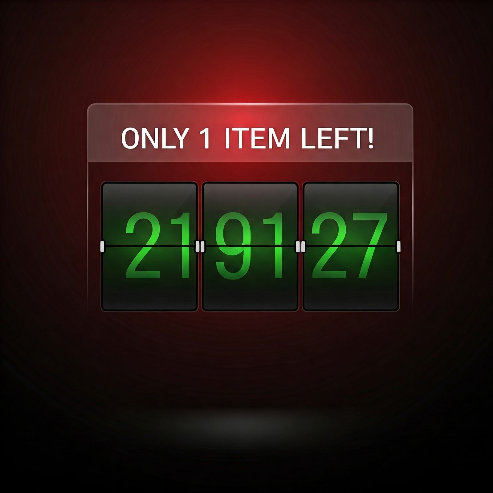
Flash Sale and Urgency Traps
This is a commonly used dark pattern in most quick commerce apps these days.
Fake Scarcity — achieved by using urgency tactics like “Only 2 items left at this price!” or “Hurry, sale ends in 2 minutes!”
This creates a sense of urgency that pressures the user to make decisions quickly. This tactic feeds off the feeling of Fear of Missing Out (FOMO).
Similarly, another common tactic is Auto-selection of Extra Options: Automatically checking boxes for add-ons, such as delivery options or other items.
Flash sales, countdowns, and auto-selected checkboxes nudge users toward taking action without fully processing the consequences of those decisions.
These are just few of the dark patterns that are used in this day and age. But are these patterns sustainable?
While dark patterns may deliver short-term results, their long-term impact on user trust, brand loyalty, and societal norms is concerning. Let’s look at some critical insights to consider:
1. Short-Term Gains vs. Long-Term Costs
Dark patterns often prioritize immediate results, like increased sales or higher sign-ups. However, when users recognize manipulative practices, the trust they had in the platform erodes. This leads to customer churn, negative reviews, and a damaged reputation. Platforms that focus on transparency and honesty are better positioned to build lasting relationships with users.
2. The Ethics of Design
In a world where design decisions influence millions, ethical considerations become paramount. Dark patterns exploit psychological vulnerabilities, but ethical design practices respect users’ autonomy and encourage informed decision-making. For businesses, this can foster goodwill and differentiate them in a crowded market.
3. Regulatory and Legal Risks
Regulators worldwide are beginning to address dark patterns. Laws like the EU’s GDPR and California’s CCPA mandate greater transparency and user consent in data practices. Companies using dark patterns risk hefty fines and legal scrutiny, not to mention public backlash.
4. The Role of Awareness
As users become more tech-savvy, they’re better equipped to recognize manipulative designs. Educating users about dark patterns empowers them to make informed choices, putting pressure on businesses to adopt ethical practices.
Designing for Trust
Dark patterns might seem like a necessary evil in a competitive market, but the truth is that trust is a far more valuable. Businesses that prioritize ethical design and transparency often see better long-term outcomes, from loyal customers to positive brand perception.
In conclusion, the question isn’t whether dark patterns are effective — it’s whether they’re worth the cost. For businesses, building trust and loyalty through ethical practices can lead to sustainable success. For users, staying informed and vocal about these patterns ensures that the future of technology respects our choices and values.
What do you think about the ethics of design in the apps you use? Share your thoughts in the comments below!
If you found this article valuable, I’d love for you to subscribe to my Substack channel. Feel free to share this article with anyone you think would benefit from it. Your support means the world to me, and I look forward to bringing you more insightful content .